If your social media strategy hasn’t changed, your results won’t either. AI is changing workflows, customers are discovering brands differently, and authenticity matters more than ever. Here are ...

14Jan


Designing an engaging website doesn’t only require attention to aesthetics but also user experience which is dictated by whether website design best practices were followed during the design and development process as poor functionality leads 42% of people to leave a website. It will also lower conversion rates and increase bounce rates, affecting the site’s performance and SEO.
To help you avoid these issues, we’ll take an in-depth look at web design best practices based on the following standards:
Branding plays an important role in web design as it shapes visitors’ perceptions of your site, helps establish credibility, and attracts potential customers.
To make the process easier, we’ll go over the three main steps to ensure consistent branding when designing a website.

A. Know Your Target Audience
Identifying your audience will help you set the site’s branding and customize its design accordingly. Here are several methods to help you understand your audience:
B. Build a Color Palette
While choosing a color scheme for your site seems intuitive, doing it strategically will highlight essential elements, shape your visitors’ perceptions, and prompt them to take action.
Brands that consistently use the same colors across their marketing materials have an improved brand recognition rate of up to 80%.
The website design best practices for creating an attractive color palette include:
If you’re a beginner and choose an analogous or monographic color palette, picking close shades is the easiest way. However, if you want the primary color to stand out, select a triadic color scheme or complementary colors.
Finally, add neutral colors to balance it out. For font colors, avoid using fully black (#000000) and choose a slightly lighter shade instead. Doing this will reduce eye fatigue while reading lengthy content.
C. Choose the Right Typography
A site’s typography consists of a font style, size, appearance, and structure. Choosing the right website typography doesn’t only enhance the site’s aesthetics but also optimizes user experience and accessibility.
For example, to convey serious messages and important information, pick a font style that isn’t as distracting as a more styled font.
Other web design best practices to improve your site’s typography include:
Use 50-75 characters per line. Don’t add more characters to avoid boredom and eye fatigue.
D. Visual Hierarchy
Strategically arranging design elements will guide visitors to important parts of the web page.
Here are several factors to consider when creating a clear visual hierarchy:
How web designers distribute visual elements on a site’s pages determines its balance. When allocating your design elements, make sure to do it proportionately to create a sense of unity and visual appeal.
The following sections will cover the most popular design practices to make your site more balanced.
Symmetrical design creates balance by placing elements evenly across the page’s center-line. For instance, if you have a visually heavy item on the right, you should add an equally heavy item on the left.
This type of design is quite popular as it is convenient for all screen sizes.
Adham Dannaway’s portfolio website is an excellent example of symmetrical design. As he makes a large caricature of himself as the focal point, the text blocks mirror each other in terms of size and position.

2. Asymmetrical Design
On the other hand, the arrangement of items does not follow the center-line in an asymmetrical design. To achieve balance, designers combine colors and textures or manipulate perspective.
For example, if you position a more prominent element near the center-line, it’s good to place a smaller one a bit further from it.
3. Mosaic Design
Unlike the other two types, a mosaic design generates a feeling of unease. This layout generally indicates motion and action, managing to draw attention with a modern and dynamic style.
II. Composition
Composition refers to the organization of website elements to give your site a cohesive structure.
A widely used framework is the rule of thirds. This method splits a design or photo into thirds using a grid of nine boxes, providing guidelines to align text, adjust objects, and generally arrange elements.
An example of this rule in practice is Hostinger’s landing page, where the elements are divided into three vertical grids.

III. Scale
During the website design process, you can use scale to bring attention to important details. Here are some web design best practices for using size differences to your advantage:
Stick with three sizes at maximum. Small, medium, and large sizes are enough to give you variety while keeping a clear website hierarchy. Generally, the sizes range from 14px to 16px for body copy, 18px to 22px for subheadings, and up to 32px for headings.
Enlarge important elements. Pick up to two key elements to enlarge so they will stand out.
IV. Pattern
When visiting a website, people follow a particular viewing pattern to scan content. Depending on the content type, they generally follow the shape of the letters F and Z.
Read more on: Website Design - 4 models, so many possibilities
Designing your page layout according to these patterns will smoothen the information flow and improve the user experience. Let’s take a look at them in more detail.
In the Z pattern, readers scan the page from the top left to the top right. Then, they scan down diagonally to the lower left and across the page to the lower right.
This pattern is ideal for designing pages with minimal copy and design elements, such as landing pages.
Meanwhile, this pattern follows an “F” shape – website visitors scan the content from the top left to the top right and repeat the process on the following lines.
Placing the most important content at the top is best to engage visitors as it is the first thing they see. This layout is a great fit for text-heavy sites like The New York Times.
V. Whitespace
Whitespace is the empty space between elements on a page. Web designers use it to break up text, direct attention to certain points, and streamline the overall user experience.
You can use color, texture, and even images as whitespace. Some web design best practices for using whitespace include:
VI. Grouping
According to the proximity principle, people perceive items near each other as belonging to the same group. If items are grouped incorrectly, visitors will have difficulty understanding your site’s structure and where to direct their attention.
For efficient grouping, there are a few tips to keep in mind, such as:
VII. Textures
Textures are visual elements resembling a three-dimensional surface that gives contrast to your design. They reinforce the site structure, make text-heavy pages more readable, and define your brand’s tone.
Here are some web design practices to consider when adding texture to your site:
High-quality images and videos can make your website visually appealing and keep visitors engaged. When adding them to your site, here are website design best practices to consider:
Another important aspect is ensuring visitors can seamlessly navigate your site and locate important information.
Create an Intuitive Menu
As the primary navigation element that visitors interact with, designers should aim to create intuitive and straightforward menus that ensure a smooth user experience.
Some of the popular approaches to designing a navigation menu include:
Alternatively, you can list specific categories to highlight important content.

The primary function of a call-to-action (CTA) is to lead visitors to take action and spend more time on your website. Whether it’s a text, image, or button, you should place it where it is easily noticeable to visitors.
NB: To create a compelling CTA, use simple, easy-to-understand, actionable words, such as “Get Started”, “Learn More”, and “Add to Cart”. Make your CTA stand out from the rest of the content by selecting a contrasting color and using it for other clickable elements.
Finally, use whitespace to guide the visitors’ eyes and position the CTA strategically to grab attention.
In addition, consider how much effort it takes to click on the CTA button, especially on mobile devices. Ensure they are easily reachable.
Often, visitors scroll down to the bottom of a page expecting to find information such as contact details, the company profile, social media links, and additional products or services offered.
The elements you should include in the footer depend on your site’s goals but, overall, to keep it clear and effective, follow these web design best practices:
Once you have a well-structured and visually pleasing design, the next step is ensuring your site is discoverable on search engines, safe to visit, and runs smoothly.
In the following sections, we’ll cover several coding standards that will help you do that, including SEO, mobile-first approach, site security, and performance.
Search engine optimization (SEO) is crucial in any digital marketing strategy. It’ll help improve your site rankings on search engine results, attracting more visitors, and increasing conversions.
You can boost your site’s SEO by following tried and tested WordPress SEO tips. Keep in mind that most recommendations are also applicable for non-WordPress sites, such as:
In addition, implementing the following coding standards also improves your site’s SEO.
50% of organic traffic comes from mobile devices, so ensure your site is mobile-friendly.
With a mobile-first approach, designers create the mobile site before moving to the desktop version. While integrating a responsive design is a good option, using this approach will give you an advantage. It’ll be much easier to start with mobile and move on to bigger screens, as it won’t be necessary to remove elements or rework the entire design to fit smaller screens.
Here are several web design best practices for designing a mobile-friendly website:
Securing your website is essential to establish credibility and avoid data and financial losses. Even if you use a secure platform like WordPress, implementing extra website security measures will help prevent cyber threats.
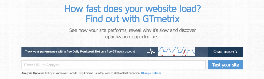
If the loading process takes longer than 3 seconds, 40% of visitors will leave the site. Hence, optimizing your site’s performance should be a priority.
To start, check your site speed with tools like GTmetrix to identify issues and get suggestions for fixing them.
Also, consider these tips when optimizing the website:
Web accessibility is another important aspect of web design, helping people with disabilities to navigate and access your content with ease.
When designing for web accessibility, follow the W3C accessibility standards, such as adding alt texts and paying attention to your site’s color contrast. For better navigation, create keyboard-accessible links.
Lastly, use testing tools endorsed by the Web Accessibility Initiative to check whether your website fits W3C’s accessibility standards.
Implementing accessibility features will improve user experience, bring more organic traffic, and boost your site’s SEO.
At the last stage of your website design process, it’s good to evaluate your web design.
NB: Consider whether it serves its purpose and whether visitors can easily scan and navigate the content. To do so, you can use an online heatmap like Zyro’s AI heatmap or a quick usability testing tool like Maze.
Conclusion
Designing a website entails a lot of trial and error. However, knowing the web design best practices will give you a solid foundation when making design decisions.
In this article, we’ve covered all you need to know about designing an attractive website based on web design standards and UI/UX principles. Get well designed website from experienced and skilled agencies like Sino Soft Limited.
Keep in mind that there’s no right way to design a website – what works for one site might not work for another. The key aspect to remember is to prioritize consistency, accessibility, and user experience. We hope you found this article useful. If you’re still looking for web design inspiration, see Projects done by us
Credit: Hostinger


Can you be more specific about the content of your article? After reading it, I still have some doubts. Hope you can help me.

Thank you for your sharing. I am worried that I lack creative ideas. It is your article that makes me full of hope. Thank you. But, I have a question, can you help me?